Nowadays large software projects are common. A large number of programmers together work on a large number of files. To keep track of each other's changes to the files, programmers can use a version control system, such as CVS, to store the files. CVS enables programmers to record the change history of the files.
Another tool programmers can use to perform their work is an Integrated Development Environment (IDE). An IDE helps programmers develop software by combining a number of software development tools (such as an editor, version control system client, compiler and debugger) into one consistent user interface. One such IDE for the Java programming language is NetBeans. The NetBeans IDE contains a CVS client which offers CVS data to the user. However, this data is not visualized conveniently making it hard for the user to gain insight in the data. This project focuses on the visualization of CVS data in the NetBeans IDE. A combination of two components is used to visualize the data: a squarified treemap and a revision history diagram. The latter component is custom designed during the project and is based on a standard bar graph. The squarified treemap is used to show a file/structure overview of the CVS data, the history diagram a revision/time overview. Figure 1 shows a screenshot of the squarified treemap view.
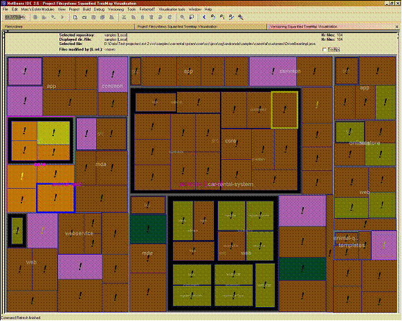
Figure Example of squarified treemap view.
>Each node (rectangle) represents a file in the repository which is being visualized. The area contained within a gray border represents a directory. The color of each node as well as its size is used to visualize certain attributes for the corresponding file. A third attribute value is visualized by the color of the exclamation mark which has been added to each node. Attributes which are displayed for each file are e.g. the number of revisions a file has, the author of the last revision of the file and the average number of lines changed aggregated over all revisions of the file.
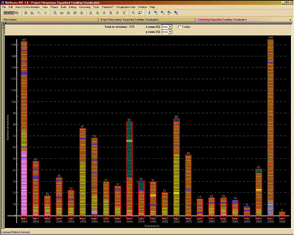
Figure 2 shows a screenshot of the revision history diagram view.
Figure Example of revision history diagram view.
As with a standard bar graph the history diagram contains a horizontal and a vertical axis and has vertical bars starting on the horizontal axis. However, in contrast to a standard bar graph, its bars consist of separate nodes (separate rectangles). Each node represents a revision. The horizontal axis represents time. Each bar corresponds to a certain time period, e.g. a month. A bar contains all revisions committed during the time period corresponding to the bar. Each node has two primary visual properties: its area color and its size. These properties are used to display certain attributes, such as the author of the revision, for each revision. Furthermore, nodes within a bar can be grouped by author.
The user can interact with the components e.g. by selecting certain parts of the data. The two components are coupled: they show two views on the same data. Communication occurs between the components to keep the views consistent at all time. A report describing the project (and tool) is available as pdf file.
A prototype of the visualization has been implemented as a NetBeans module. This way the visualization has been integrated in the NetBeans IDE. The prototype is available as an nbm file for NetBeans 3.6. Note that the module does not work in NetBeans versions newer than 3.6.
More information on the project can be obtained by contacting dr. ir. Huub van de Wetering.